Get our undergraduate course guide
Our undergraduate course guide has all of the information you need to get started at Curtin.
Our diverse range of undergraduate and postgraduate courses provide you with the right skills, knowledge and experience to enable you to follow your passion and put it to work at Curtin.
Our goal is to ensure a Curtin education remains relevant and valued both by students and employers. By aligning our teaching with the needs of industry, we contribute to the knowledge economy of our nation and future industry leaders.
Curtin is recognised internationally as a leader for the quality of its research higher degree programs.
We’re ranked in the top 25 universities in the world for the field of Architecture, the top 70 in Education, the top 100 in Language, Communication and Culture and the top 150 Globally in Creative Arts and Writing (URAP 2022-23). What’s more, we’re currently the highest-ranked university in Western Australia for Architecture (QS World University Rankings 2023).
Faculty Staff can access the Humanities portal here to view the latest Humanities resources and news.
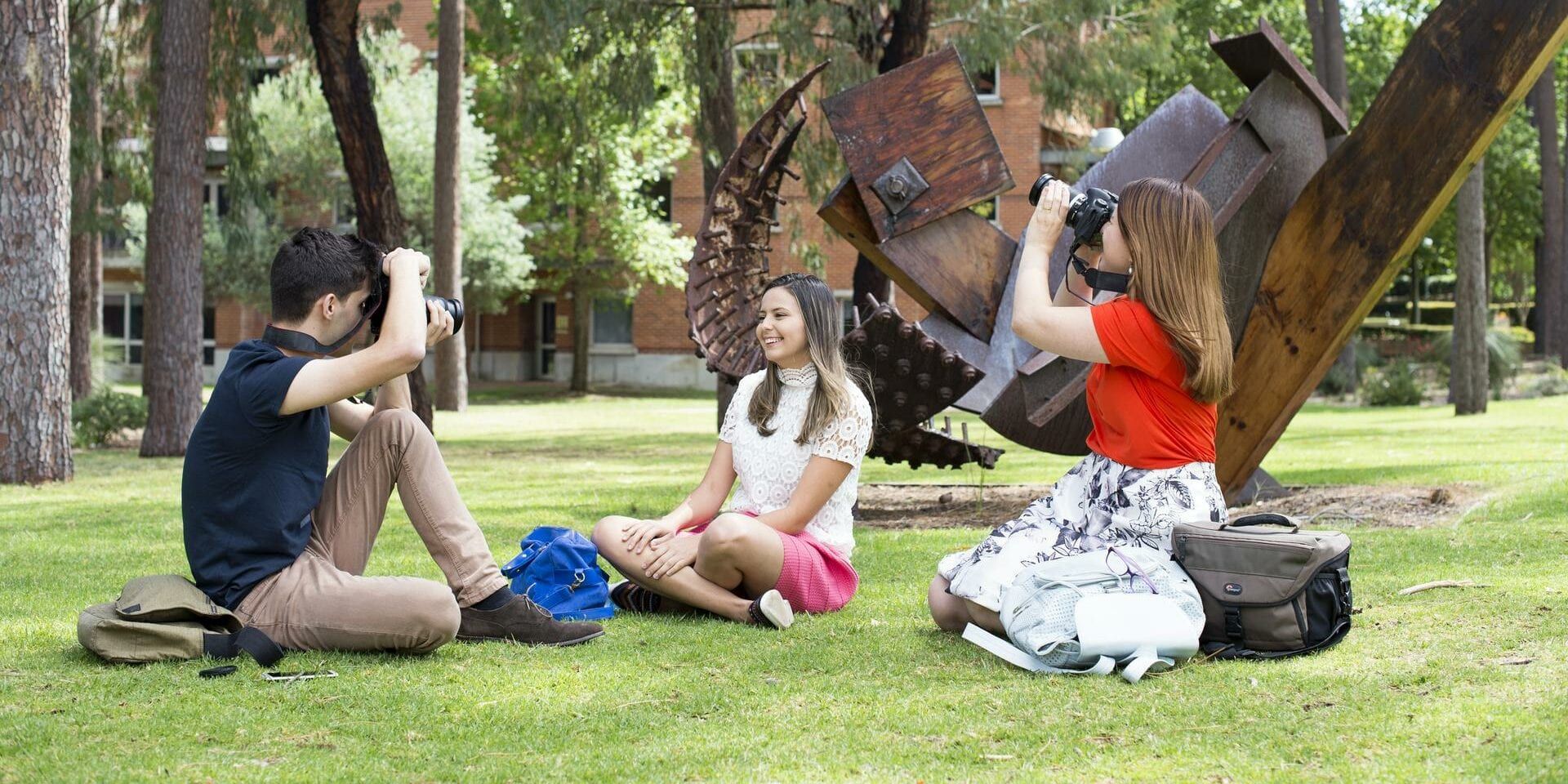
The Faculty of Humanities comprises of three schools, each with multiple disciplines which specialise in a wide array of degrees so you can follow your passion and put it to work at Curtin. Our schools teach practical and transferable skills that can be applied to a range of workplaces.

Are you a creative person who is fascinated with design, urban life, buildings and the environment, or do you have a desire to improve living conditions for all people?

Are you driven to help others? The School of Education prepares professionals for practice in a wide range of education-related fields. We are known nationally and internationally for the quality of our programs.

Are you curious about new ways of thinking, creating meaning or managing information? Whether you’re a creative individual, ready to find an individual voice to make your mark on the world or looking to apply your critical thinking to make a difference, the School of Media, Creative Arts and Social Inquiry offers courses which produce job-ready graduates.

Our undergraduate course guide has all of the information you need to get started at Curtin.

Our postgraduate course guide features all the information you need to further your studies at Curtin.

Our guide provides you with all the information you need as an international student.

View our range of upcoming scholarship opportunities available for Humanities students.
We provide opportunities and experiences to enrich curiosity, creativity, and knowledge.

Stay in the loop with our events, news and podcast series, The Future of.
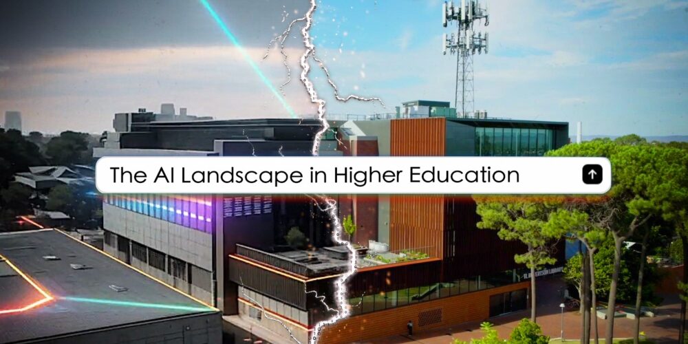
Curtin University has today released the first short film in a new six-part series which aims to explore how AI…
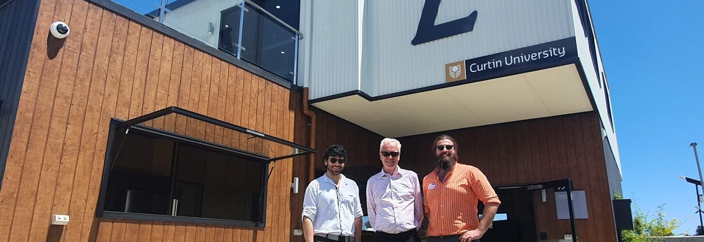
A presentation by the co-creator of Curtin’s Legacy Living Lab (L3) – a circular economy building in Fremantle designed for…

The COVID-19 pandemic resulted in many innovations in how we interact digitally — and a Curtin University research project has…

Important new online resources aimed at tackling extremism and disinformation in the community have been launched in Western Australia. Created…
This is a fantastic opportunity to enquire about the wide range of learning offerings Curtin has available, check your eligibility…
![The Strelley Mob and N’yettin-ngal Wagur – Yeye Wongie [Ancestors breath – Today talk]](https://resources.curtin.edu.au/assets/img/placeholder/banner-campus.jpg)
Experience the story of the Pilbara strike of 1946 through an innovative technique blending art, history and animation. The Strelley…
Calling all queer community members, Join us on Tuesday 30 April as the Curtin Carnaby’s take on the University of…
This is a fantastic opportunity to enquire about the wide range of learning offerings Curtin has available, check your eligibility…

Imagine we could harness the power of good gut bacteria from healthy people to fight off stubborn gut infections in…

Can MS be slowed down or even reversed? Find out on this week’s episode of #TheFutureOf

How do we overcome barriers to education in Australia? Find out on this episode of #TheFutureOf

How did a simple molecule found in smoke change the way we regenerate native plants? Find out in this episode…
